> Accessibility Is On Us
As any parent knows, kids get sick, especially when they are of a young age, and sometimes it's troublesome to give them medicine. I, the adult in the room, usually say: "Come on... It's not that bad" and proceed to give myself a small dose.
That's what I did a couple of days ago, and this time around it was that bad.
Half an hour after one drop of Atropine Sulfate in each eye I was having difficulties focusing. On the following day, I could only see things further than a meter and my eyes were hypersensitive to light.
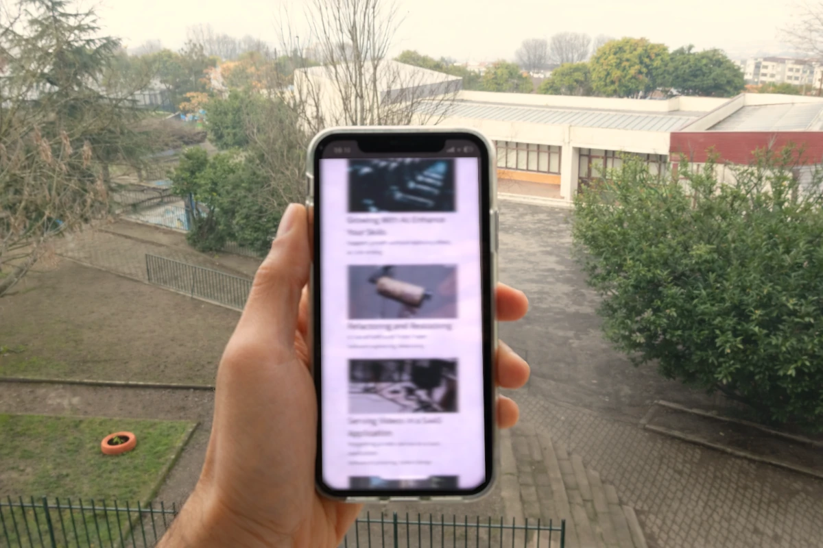
Font Scaling
iOS
Since I could still see and read from the distance, I started changing my accessibility settings.
Finding the right settings was challenging. My wife was not home, and at that moment, I wondered if Siri could have helped me a bit more with such a task.
Using apps like Messages, Mail or WhatsApp was manageable. All content was responsive, making it possible to read.
The experience with other apps was mixed. My own (note: I don't work on the mobile team) Shares app worked well, most text was responsive to my system settings, on the other hand, apps like the BPI or Bankinter (two banks that operate in Portugal) were impossible. To make things more difficult, some apps that use MFA in the app (i.e. logging into the browser) were only usable with iOS' zoom feature.
Browsers
The next step was ensuring that I could join my meetings, check my calendar, or boot a VM. I was lucky that many of the services I rely on have a "traditional" web presence through browsers.
The flexibility of the browsers was essential for the work I was doing. Pretty much all I had to do was turn on the zoom feature to 140% by default and voilà, most things were readable.
I should offer big props to GitHub, where I perform my PR evaluations and also use Copilot Agents. It shows that even applications with dense content can be highly accessible.
Coding
Using VSCode and Terminal was mostly fine. Reading and writing code, using the context menus, autocompletion, all AI features were readable.
Running heavy processes that print in the terminal tens of lines per second, was a problem. The large fonts make text go "over the fold" too quickly, which highlighted the importance of coloring logs based on severity.
The Necessity of Dark Mode
This feature made so much difference. It made me regret thinking that former colleagues were using accessibility as an pretext to implement dark mode.
I was wrong.
As brightness was an issue, using the dark mode together with large fonts was extremely helpful, and, while in the browsers I could use the Dark Reader extension to force dark mode, on the iOS apps I had no choice. Looking at those white screens really hurt, and I could do that only for a couple of seconds until I had to look somewhere else.
Thankfully, even when being forced to look at those small fonts and white backgrounds, I most of the time knew where to look.
Familiarity and Physical Safety
Familiarity helped me a lot, in both real and digital worlds.
Knowing where to find some phone settings, or where to click to do something helped me so much. Even though I could not clearly read what was written on that orange button with white text, I knew I had to click there.
Our brain is a powerful machine, and those moments made me realize that we don't see all there is. We see what’s focused; the rest is filling the gaps.
Takeaway
We as developers have a serious influence on how our users are impacted by our work and we should remember that visual impairments can happen to all of us, temporarily or not.
Caring for basic accessibility features won't derail the delivery of good software and the tooling we have for web and app development ensure we all can identify and fix issues quickly.
Familiarity is important and we should not be moving things all the time in our apps. Even small, poorly thought changes can cause serious issues. Imagine if we switch the colors or positions of the "Cancel" and "Confirm" in a highly used part of an app.
And last, let's be curious, not reactive. Next time around, Celso, don't brush off someone's points: that's hubris and ignorance.
Notes
2026-03-09: A couple of friends reached out to check if I was okay. Yes, I am! The effects of the medication in my eyes was over in 4 days.